
Determining Lighting Source Quality
Whether you’re an artistic person or not, our eyes are sensitive to light quality and colour. A red shirt lit directly with noontime sunlight will render much different than if lit under a fluorescent bathroom light. You will ask, why does this colour look so different under different lights (Different as in: unsaturated, colour shifted, dull, untrue, etc)?
The question is, “How do we determine the right light quality that render true colours?” After all, the benefit of light is not the light itself, but the objects and places it illuminates.
Typically, the standard light source that we compare others to is our special star, the sun.
Some lights render colours better than others compared to the sun. There are a couple of different methods to test the quality of light:
– Color Rendering Index (CRI)
– IES TM-30-15
– Colour Quality Scale (CQS)
But First… What is Colour Temperature (CCT)?
It should be mentioned that the colour rendering is different than colour temperature. Here is a brief summary of what colour temperature is:
In the lighting industry, correlated colour temperature (CCT) refers to the colour appearance of light emitted. Not all white lighting is equal, as you well know. When some metals are heated to a particular temperature, measured in degrees Kelvin (K), they appear to give off different colours of white. -ie. 3000k warm white or 6500k cool white). For instance, a white light can have a warmer colour which looks yellowish, amber or orange to our eyes, or it can be a cool white which will look bright white or even slightly bluish white.
With respect to sunlight, noontime sun would be cooler than the colour temperature of the sun during sunset. As you read on about what CRI is, you’ll see the relevance of knowing colour temperature as well.
To learn more about colour temperature, visit our page about Tunable White LED strips
What is CRI?
Colour Rendering Index, commonly referred to as CRI, is a method we can use to measure how colour looks to the human eyes, depending on the light source as compared to the sun. The CRI provides a scale of values up to 100, with 100 being the best colour rendering light quality and a value below zero representing very poor colour rendering. The higher the CRI value (also called CIE Ra), the more accurate the colours will be.
When a light has a CRI of 100, it means that there is no difference in colour rendition between the light and the reference light (the sun). Likewise, a CRI of 75 means that the light bulb renders a 75% replication of the visible colours that the sun shows, given that both lights have the same colour temperature. That means that if the reference light is the light of the sun during sunset time, the light source being measured must also have the same colour temperature for the most accurate comparison to measure CRI.
Basically, this CRI value helps us determine how well the light source can reveal colours to the human eyes.
When we talk about accurate colour, it’s in reference to the colours seen under a chosen reference light, usually the natural light of the sun. A reference light could also be another light source, like halogen lighting. Light sources that have a CRI of 90% or higher let our eyes see excellent colour rendering, but between 80-90% is also considered good lighting for colour.
It should be noted that a CRI of 100 does not mean perfect lighting, nor are the colours perfectly accurate. The CRI value is an expression of how close the observed light is to the reference light. If the reference light doesn’t show good colours, then a CRI of 100 wouldn’t be preferred.
How is CRI Calculated?
The value of CRI for a light source is calculated by testing colours. The Commission Internationale de l’eclairage (CIE) established a scale of 8 CIE standard colour samples for the CRI method. In rare cases, there are an additional 7 other colours that can be used, but only 8 are commonly used to measure CRI value. The test involves comparing the eight colour samples under the light source and then comparing it to a reference light source, usually the sun. The average differences are then subtracted by 100 to get the CRI value. That is why light sources that show more “real” colours have higher CRI values, the average differences are smaller between the light source and the reference light.
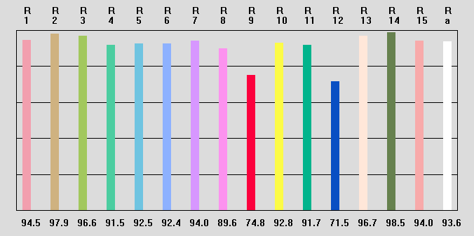
Flexfire’s test results of CRI with 15 colour comparisons. Normally, CRI is compared with only 8.
The first problem with the CRI method of measuring light quality is that it only uses eight colour samples out of the many that are possible. Secondly, these colour samples are pastels, not saturated colours. Lastly, light sources can only be compared when they have equal CCT. Is there a better way? YES!
This method was established in 1937 and last reviewed in 1974. With all the new capabilities in lighting technology, a new method for measuring light quality was long overdue; hence, the development of the IES Method explained below.
What is IES TM-30-15?
IES stands for Illuminating Engineering Society, which is the organization that developed the new and improved method called TM-30-15 for evaluating light source rendition. Colour science research backs this new method and provides an even more accurate measurement of colour rendering.
Currently, TM-30-15 is used in conjunction with CRI, however it will eventually replace the CRI metric. The TM-30-15 method uses a Fidelity Index, Gamut index and Colour Vector Graphic to evaluate the light source colour rendition. The difference between the Fidelity Index of CRI and TM-30-15 method is that the latter uses 99 colour evaluation samples (CES), instead of just 8.
Fidelity Index (Rf)
The Fidelity Index is used to measure the light source’s closeness to a reference source, just like described in the CRI method. The scale using the TM-30-15 method is from 0 to 100 and uses 99 colour evaluation samples. The use of 99 colour samples versus just eight colour samples allow a more statistically representative and reliable metric in showing how accurate the colors will be shown. The 99 colours in the TM-30-15 Fidelity Index were chosen from real world objects.
They have been further categorised into 7 groups:
– Nature
– Skin colour
– Textiles
– Paints
– Plastics
– Printed material
– Colour systems
This categorisation is beneficial to LED lights because the testing can be application specific. If an architect is looking to show certain paint colours, he/she would mainly look at the paint colours category of the Fidelity Index.
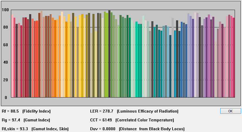
Fidelity Index (Rf) Compares 99 Color Samples
Gamut Index (Rg)
The definition of the word ‘gamut’ is “the complete range or scope of something.” The Gamut Index, in lighting, is used to measure the increase or decrease in Chroma of a light source. Chroma is the quality of the colour’s purity, intensity, or saturation. For instance, the colour of a red fire engine is a high-Chroma red and a neutral grey is a low-Chroma colour. An Rg score that is around 100 means that the light source can produce colours with a similar level of saturation as the sun at daylight (approx. 5600K/6500K). When looking at LEDs, to get an acceptable colour quality, the score should be between 80 and 120; higher scores represent higher levels of saturation (the intensity of colour). When the score is above 100, the colour will be more intense than it’s natural colour in the sunlight.
Colour Vector Graphic
This form of measurement reveals how certain colours appear with the observed light, whether the colours show up dull or more vivid. The Colour Vector Graphic is an intuitive tool that shows which colours will be more or less saturated, or just right through a visual representation. Instead of through numbers, this graph shows you the changes of hue and saturation which is a great complement to the Fidelity and Gamut Indices.
Since the Fidelity and Gamut Indices are based on averages, you’re not able to tell which colours are saturated. This is where the Colour Vector Graphic is important to understand if you have an application specific need for the LED lighting. The Colour Vector Graphic used along with the values of Rf and Rg will help provide a more precise idea of how true colours will be with that light source.
The graphs below are Colour Vector Graphics; the following will help you interpret the graphs:
1. The black circle represents the reference light (the sun) and the red shape is representative of the test light.
2. The black circle is made up of the 16 hue bins (colours put into categories) of the reference light.
3. Any red line inside of the black circle means that those hues are desaturated by the observed light when compared to the reference light.
4. Any of the red line outside of the black circle means that those hues are oversaturated by the observed light when compared to the reference light.
5. When the red line overlaps the black line, the hues rendered are the same for both lights being compared.
6. Perfect overlap of the red and black lines means that there is no difference in colour rendering between the two light sources.
Quick Overview of Colour Vector Graphics:
– Outward shift represents more saturated colours
– Inward shift represents duller colours
– Sideways shifts (the whole red shape shifts) mean a hue shift
– Lastly, no shift means that the colours are not distorted
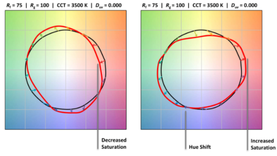
TM-30-15 High Fidelity and Full Colour Gamut LEDs | Yuji LED
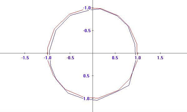
Flexfire LEDs High CRI 6200k Test
CQS – Colour Quality Scale
Another method we use to determine and analyse lighting quality is called CQS, or the Colour Quality Scale. This was also created from the need to find an alternative to the unsaturated CRI colours. Developed by NIST, there are 15 highly saturated colours that are used to compare chromatic discrimination, human preference, and colour rendering (the method evaluates 15 colours to more accurately span the range of normal object colours) Source.
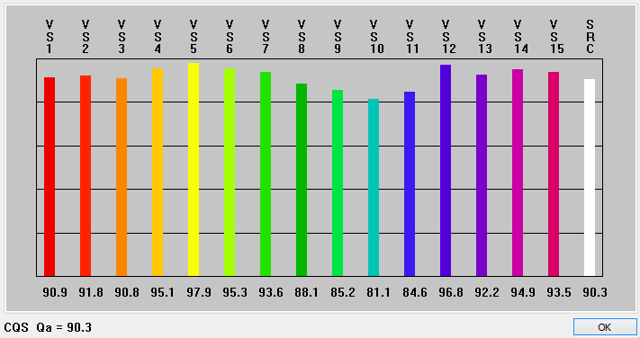
CQS example of our UltraBright™ High CRI 6200K LED strip light
Summary of terms
Below is a quick recap of what you can tell with these lighting measurement tools
CRI – Colour Rendering Index – How closely the observed light can render colours like the sun, using 8 colour samples.
Fidelity Index (TM-30) – How closely the observed light can render colours like the sun, using 99 colour samples.
Gamut Index (TM-30) – How saturated or desaturated colours are (aka how intense the colours are).
Colour vector Graphic (TM-30) – Which colours are saturated/desaturated and whether there is a hue shift in any of the 16 colour bins.
CQS – Colour Quality Scale – An alternative to the unsaturated CRI measurement colours. There are 15 highly saturated colours that are used to compare chromatic discrimination, human preference, and colour rendering.
Why is Knowing CRI and TM-30-15 Important?
Understanding how CRI and TM-30-15 renders colour will help you choose the best lighting product for your project. If you have a photo studio, art gallery, beautifully coloured kitchen backsplash, or retail product display, you may want light that will be as close to natural lighting as possible. Now, you know that the higher the CRI percent is, the more accurate the colours will look to the human eyes. When it is important that artificial light renders colour accurately, CRI and TM-30 are good measurement methods to rely on. A couple of examples where colour rendering would be important are in manufacturing companies or fashion design offices where people need to compare colours. You can find more information about TM-30-15 here.
Below are a few examples of how you can use these new TM-30-15 metrics:
When Rf and Rg are both below 70, you can conclude that the lighting will be fairly poor.
If you want dim lighting and colour vividness isn’t necessary, this lighting would be acceptable.
When Rf is below 80, but has a high Rg it indicates that the lighting may not be perfect, but you will get some vivid colours.
This is good for grocery stores. A hue shift in the orange hue bin, as shown on a colour vector graphic, allowing a more orange colour where carrots are displayed will make the carrots look more appealing to customers. The same thing goes for lighting over a tomato or apple display; the hue shift should be towards the outside of the black circle which will have the red tones more saturated. This will enhance the appearance of these products, in respect to their colours.
Retail stores can use this knowledge as well. If clothes are grouped by colour, the lighting can be used to enhance those colours so that they appear more blue/red/orange/yellow/etc.
When Rf is above 80, but has a low Rg it indicates that some colours are desaturated.
Using a colour vector graphic, a photographer may use lighting that desaturates red tones when taking portrait photos.
A perfectly overlapping Colour Vector Graphic indicates a light that perfectly matches the reference light.
This should be used when you are creating a design that needs to mimic natural sunlight.
How Does Flexfire LEDs Fit in?
Whether you are remodelling your own home, a professional interior designer, a photographer, an artist, or anyone else who works with colours, LED lights are one of the best tools for design.
We have the UltraBright™ High CRI Series strips, all of which have a CRI rating of 93, high Rf and Rg. These lights are perfect for the photographer who needs bright and natural looking light for the studio; for the retail store looking to display the various clothing colours available; and any other commercial or residential projects that place a high importance on colour rendering by light. Not only will choosing the right CRI for your light strips help you create the look you want, but you are also cutting down on energy use with LED light strips. If you are still hesitant about choosing one on your own, we have reps available to help you decide on the best high-CRI LED light strip for whatever your project may be.
We can also customise some of the above characteristics for your specialty application. We are available to assist you throughout the design process to make sure you have the best LED lighting for your application.
Source: https://blog.amerlux.com/cri-vs-tm-30-what-do-these-color-quality-measures-mean/


